
Monday, 24 March 2014


10. What would you change about the trailer?
10. What would you change about the trailer?
“I would want to see a few more day-
to-day clips of the main character”
“I’d like there to be a few more jumpy
scenes that would make me panic and worry”
“I’d like to have a bit more information
on what the film was about, so I knew if it was for me”.


3. What was your overall impression of my trailer?
3. What was your overall impression of my trailer?
“There was a sense of realism to the trailer”.
“The rhetorical questions made me sit and question myself”.
“I want to know what that thing is, what is it doing?”
“There was a sense of realism to the trailer”.
“The rhetorical questions made me sit and question myself”.
“I didn’t know what type of film it would
be until the music kicked in”.
“I want to know what that thing is, what is it doing?”


Evaluation Survey
Film Survey
I am carrying this survey out to help me
understand what you enjoyed about my final thriller/horror trailer, the trailer
was created based on the results I collected form my first survey. Below are
some questions to help me understand what worked and what didn’t so I’m able to
improve in the future. Thank you for being part of this survey and taking your
time to fill it out. Tick the
answer that best suits you.
1.
Are you male or female?
Male Female
2.
How old are you?
Under 10 years 10 to 20
years
21 to 30 years
31 to 40 years 41 to 50 years
51and over
3.
What was your overall impression of my trailer?
……………………………………………………………………………………………………………………………………………….
……………………………………………………………………………………………………………………………………………….
……………………………………………………………………………………………………………………………………………….
4.
Did you feel yourself answering the rhetorical
questions featured in the trailer?
Yes No
5.
Did you think the music/sounds suited the
trailer?
Yes No
6.
When the heartbeat was added, did you feel more
tension?
Yes No
7.
Did the trailer hold you attention the whole
time it was playing?
Yes No
Why?
……………………………………………………………………………………………………………………………………………….
……………………………………………………………………………………………………………………………………………….
8.
Did you think the text fitted the
thriller/horror genre?
Yes No
9.
Did you understand the story that was forming in
the trailer?
Yes No
10.
What would you change about the trailer?
……………………………………………………………………………………………………………………………………………….
……………………………………………………………………………………………………………………………………………….
……………………………………………………………………………………………………………………………………………….
11.
Do you think the magazine front cover fits the
trailer?
Yes No
12.
Do you think the poster fits the trailer?
Yes No
13.
Would you go and see the film based on seeing
the trailer, magazine cover and poster?
Yes No
Magazine Cover draft 2

Magazine Cover draft 1

Poster draft 3

Poster draft 2

Poster draft 1

Blocking Photos - Garage

I have only shown one side of the garage for only one side is useable
for the other is blocked off. As you can see from the photo that I have a fair
amount of area to work with and have a lot of props to move around and
experiment with. Also allows me to use the room for the scene where I intend to
hide the ‘thing’. Using this room would make them visible if I chose too or
could make them hide within the props easily. Like the other rooms I have
selected to take into consideration for my filming it has a normality element
to it and portrays the realism to the trailer as it isn’t ‘perfect’ and is in a
natural environment. Have the doors with the windows at the top also allows and
element of fear for anything could appear from it and nothing is there to block
of the darkness, where as the kitchen has something to cut it off.
Blocking Photos - Kitchen

Blocking Photos - Lounge

I only took one position from lounge due to how the room is laid out I
wouldn’t have much movement, but the furniture is in preparation to be changed
so with the new furniture I will be able to have more movement with the room. I
plan to use this room as it is the ‘gathering’ area for the family like any
other family would do. This theme of this room also flows off the other rooms
that are used a family rooms, therefore this informs the audience instantly
what kind of room it is. The lounge has plenty of space for me to use and with
the position the photo was taken in it gives the illusion of the room being
larger than what it is. You are able to see the television as well as the sofas
in the area which gives me plenty of chances to experiment. The curtains are
also useful as it will allow me to choose to cut of the garden or open it up
depending on what I think would be more effective in my trailer. I shall have
to consider where I would get my lighting from if I wish to turn the lights off
to create me desired atmosphere for the scene but this can be worked out when
the moment is in place.
Blocking Photos - Hallway

The hallway I have chosen for my trailer is perfect fro what I need it
for as it is long enough for my to get some long shots of the character walking
through it, but also has doors coming off it to each room and they are all
visible from the bottom end of the house. I took some pictures of it in the
dark with the light coming from the lounge/dining room area to see what effect
it would give my when filming. It also meant I was able to see if it works
successful. I then look picture of it with the lights on so I was able to see
the simple elements. For the room contains very little which means there
wouldn’t be anything to distract my audience when they should be focusing on my
character. The room also helps portray the normal lifestyle the character lives
which makes it more relatable to the audience (helps with realism). As you can
see from on of the pictures that the front door is right by the selected
bedroom for my character which could be very using when filming as I could try
some different things to help play of the thriller genre, I do feel that just
looking at this picture with the lights on it still has an ‘eeary’ feel to it.
Blocking Photos - Master bedroom

As you can see from the master bedroom that like the hallway it doesn’t
contain very much which means if I choose to use this room there isn’t much to
distract the audience. Also though there isn’t really any message that implies
that it is a parents bedroom there is an instant feel there is from the simple
theme is has for there it is all neutral colours and doesn’t have many
accessories. Unlike the intended characters bedroom this rom doesn’t really
give off any message to the audience about what the characters are about. So I
would have to be careful with what I use this room for, if I use it at all for
it could become a unnecessary area. Although this room does have a lot of space
for me to work with so I could easily add some props to it to give off the
right messages if I wanted too.
Blocking Photos - Character bedroom

This is the bedroom intend to use for the characters bedroom as it has
a lot of features I plan to use. For example, the mirror on the back wall when
you walk could be interesting to work with as it will allow me to be creative
with the camera on how I could film her without being in it myself. It also
contains a even amount of dark colouring so when the lights are off there is a
slightly creepier atmosphere than a yellow colouring would. Mentioning the
colouring of the room it also portrays the right message of the characters of
being a typical teenage which helps to develop the realism of my trailer but
also allows the audience to understand what the character is about. The
positioning on the bed also means I am able to have moment from the ‘thing’
that I plan to appear from under bed. The only issue with the room is the size
for I will have to position myself close to a corner to be able to get some
long shots bearing in mind I have to avoid the mirrors on the walls as well as
the mirrored wardrobes.
Blocking Photos - Front garden

As you can see from the picture that there isn’t a large area of front
garden to work with but it does play on the thriller genre I selected. I put
the flash on to see what it would be light if I had a touch on whilst filming.
Looking at the picture I think it worked successful as it only lights up the
close areas and only shadows the distance areas which leave you unsure of what
is there. This shot could be used to help build tension with the audience
viewing my trailer. The stoned driveway also means I could use different noise
effects to make it clear someone could be outside. From the picture you are
able to see a few houses in the background which would inform the audience it
isn’t a typical thriller/horror where they are in the middle of nowhere so will
therefore play more on the normality of the trailer and means the audience would
be able to relate to the trailer a lot easier.
Blocking Photos - Back garden

As you can see from the photo I took from the backdoor leading onto the back garden that even with the flash on it is very hard to see anything past the decking area and the rest is a shadow or just darkness to the eye. I think this setting would work successfully in my trailer as it allows the unknown to occur. And even if there isn’t anything there if the right amount of tension has been built with the audience they shall fear the darkness. Having the scene filmed from the decking will also inform the audience that it is still part of the house. Even though I believe it would be a useful setting to use I shall have to bare in mind that the lighting will be an issue otherwise my audience may not be able to see anything that is taking place
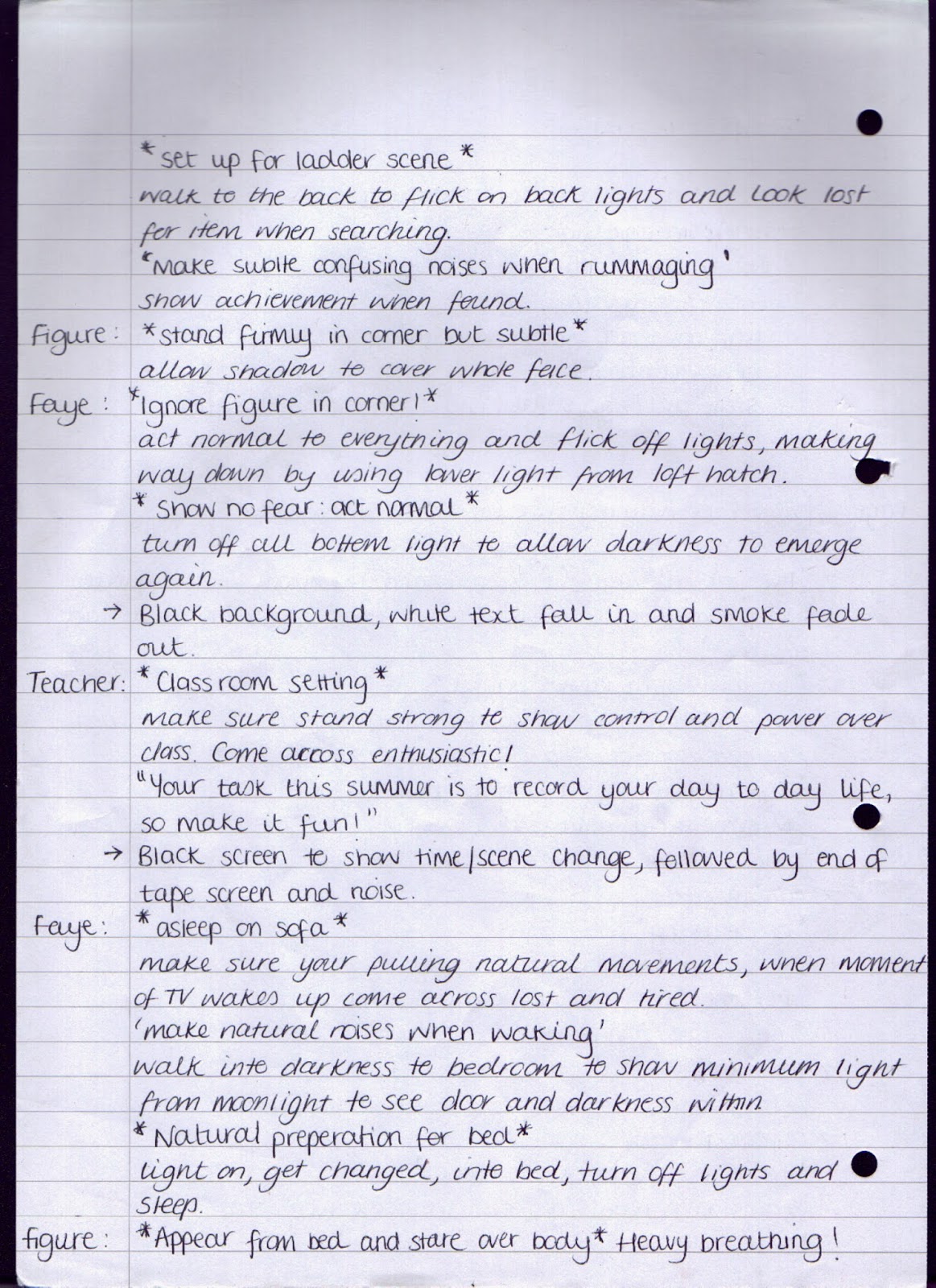


Key points to consider before I begin filming
How do you ensure you get
the well thought out professional shots you need?
· Storyboarding and plan it out.
· Practice shooting in desired area.
· Knowing the shots you want to use and practicing them.
· Take time to line up all your shots correctly and make
note.
· NEED tripods, unless wanting hand-held shots involved.
· Rehearse with the camera beforehand.
· When shooting make you shoot more than once!
· Consider lighting, DON’T film at sunset.
· Run camera slightly before and after shot to make editing easier
for me.
· Film all shots in the same scene on the same day.
How do you ensure that your
actors are ready to be filmed?
· Make sure they are suitable for what you wanted.
· Give them a personal script and the basics before
filming.
· Show or give them a copy of the storyboard so they know the image
you actually have for the whole film.
· Make sure they know the whole of the dialogue.
· Make sure I take time out to check up on the actors so they don’t
fall off task.
· Make sure they understand the task fully and there is a clear
outline to everything.
· Rehearse beforehand.
· Make sure they know where they need to be and when they need to be
there.
· Make sure they fit the desired costumes, either providing for them
or inform requirements.
· Inform type of shots taking place with them, so it isn’t a
surprise.
· Make sure you stay in contact with the actors so you can all stay
up-to-date.
Superman Magazine Cover Analysis
For the edition of Total Film the mast head has
been placed central on the front cover with the feature article image on top of
it. The mast head has been stretch to almost fit the whole width of the
magazine so customers are still aware of what magazine they are reading even
when the feature article photograph/image as been placed on top of it. Having
part of the mast head covers says that the magazine is a success and feels it
is well-known enough to not have it all showing and says that the character on
the front cover has a lot of powerful and is important to the edition. Unlike
other edition of Total Film the mast head has been coloured white so it can
stand out from all of the other colouring upon the front cover, this has been
down with the puff and plug on the page as well with the odd featuring of red
text.
In this edition there isn’t an obvious cover line
that is usually based in the middle of the feature article image. What stands
out the most of being a cover line is the ‘Superman speaks!’ due to it being a
different font to the rest of the text but also it had been enlarged to stand
out more. The text has also been placed on top of the feature article image
where it has been placed to show this is what the feature article image is portraying.
Looking at the feature article image instantly you
feel a strong presence from the character as her is looking straight onto the
camera with powerful and his arm has been folded to show defence and strength.
To help portraying the message the background for the front cover is a dark
silhouette of a city skyline which instantly gives of the thought of ‘control
and professional city man. Although the feature article image has made a
presence the strip of other clips doesn’t allow the image to have the same
amount of power for it takes your eyes way from him and you look at other
things on the page which could mean that the character has some weaknesses as
well. When you look at the clothing of the character it is confusing if we are
going to be taking the actor or the character but with the little give away of
the superman symbol underneath we know we will be talking to the charter. The
clothing he is wearing also f=gives off a more relaxed feel which would make
the customers more relaxed that defensive about the character.
Due to the clothing, appearance, clothing of text
and background I would say the over feel of the magazine edition has more of a
male target audience interest. This is because I feel even though it is
structured the large amount of plug/puff and pull-ins make it look fairly
untidy and the dark colouring necessarily look interesting to the female target
market.
If there wasn’t the odd area of red text I don’t
feel the front cover would make much of an impact as the red against the white
and black areas instantly catches your eye and highlights areas that would pull
the target audience in to read the magazine.
And although we know the character on the feature
article image is a superhero I cant help but feel there is an evil feeling being
given off due to the darkness around him which could. This could have been done
to throw the audience off the film or to inform them there is something
mysterious about the film that is feature in the film magazine.

Jennifer's Body Magazine Cover Analysis
Looking at this edition of Total Film you can see
the master head of the film magazine has been placed centre at the stop of the
page with the spacing for more information to fit above in the top margin. The
mast head has been placed underneath the feature article photograph/image. The
reason why they have done this is to show the actress on the cover is powerful
and dominating. It also says that the magazine is well-known and has the
confidence in itself for customers to recognise what magazine it is. Although
her head has been covered slightly by the information above the mast head which
informs us she doesn’t has complete control.
The front cover layout of the edition contains a
fair amount of plugs/puff or cover lines, this has been done to inform the
target market the magazine contains a lot of information inside but the space
that has been left blank has been done to highlight the importance of the
feature article photograph/image; also not including much makes information on
each section means the target audience will want to buy it to be able to find
out more. By not having many plugs or cover lines it also gives off a tidy and
mature look to the target audience because it looks as if has more structure
compared to other editions the magazine produce. It also allows the audience to
take in the feature article image because at firs you only notice her but in
the blank areas you notice her right hand is covered in blood. And there are
blood stains by her left foot. So this throws of the innocence of this
actress’s character.
I do feel as if the feature article
photograph/image has a lot to do with the powerful feel you get from this
edition, I believe it is down to the way she is standing towards the camera.
Despite the fact the photograph has been taken centre to the character’s body
you get the impression she is looking down on the camera. Also her eyes have
been Photoshop to be move piercing so you instantly notice her eyes. Before
reading any of the information on the magazine cover you are able to tell what
kind of film this actress is featuring in. and despite her beauty there is
something evil about her. Despite there being a variety pf colour of the front
cover it still remains to look mature and simple as the colour used for the
text has been selected to match the colouring on the character. This is to
shown continuity on the page but I also believe it has been done that this
image has taken complete control of the page as the colouring of others things
that are feature follows it.
The feature article photograph/image is definitely
the main highlight to the front cover even with the red bold of the mast head
behind. And although it isn’t the first
thing you notice as shown as you see the blood on her hands and the flow you
cant help notice it all the time and fear the character even though she gives
across the impression of a typical teenage American cheerleading girl.
The plug is also used to clearly identify to the Total
Film magazine target audience who is on the feature article photograph/image. I
get the impression that this magazine been designed to interest a mix of gender
audience/reader due to the fact the cover image is of a strong female which
wouldn’t interest men but the colouring theme of the rest of the magazine would
interest them and so would the puff and plug that has been placed to catch the
audience and draw them in. The tone of this edition of Total Film given off is
almost calm, serious, well organised, mature but has a sense of fear and
mystery also purely due to the feature article image.

Avatar Magazine Cover Analysis
The mast head has been placed top
central of the front cover underneath the top of the feature article
photograph/image. In this
edition Total Film have the place the mast head underneath the actor who in is
the feature article photograph/image to make inform the reader instantly the
power and dominance this character has within the film they star in. They have
also cleverly used white for the colouring of the font to make it contrast with
actor’s dark brown hair and deep blue complexion doing this makes the imaging
more eye catching to the target audience.
With the first look at the magazine it is clear
that there is a fair amount of a variety of plugs and puffs on the front cover
with are flushed right and left of the page also containing smaller information
of what is featured in the magazine. Plug is used to identify the actor’s
featured on the front cover and to also inform the target audience what else is
appearing within this Total Film magazine edition.
In this Total Film edition the
impression communicated to the target audience about the main featured is a
mature, powerful and out of this world. This is due to the actor on the cover
having special effects used to make him look like he is some form of creature,
although this has happened it is a still clear it is a male and human based.
The mature and powerful impression comes across due to the colouring being used
because blue is a calm and simple colour. Also the way he has positioned
himself to the camera and is looking down on it which instantly gives over a
dominating impression to the audience. His serious and stern face also implies
a sense of drama to the film being advertised with the magazine. Although there
is a lot of colour of the cover it has remains either blue or white to stop it
being over powering but still remaining to be eye catching. Although white has
been used in the background of the feature article image you are still able to
see the text on the page but the colouring just allows the feature article
image to draw the audience in (the main focus of the magazine). Although the
front cover contains some plug and puff it has been kept at a reasonable
minimum otherwise too much information and text won’t interest the target
audience to buy the magazine because they will see everything on the front
page. It also takes away some of the power the image has. On the cover there
are a few rhetorical questions to also draw the audience successful for it
allows them to think and get involved with the magazine.
The plug used at the top of the front cover and
above of the mast head has been designed to catch the target audiences eye
whilst the magazine is on shelf because it high lights within the magazine
itself.
The overall layout of the Total Film
front cover is very basic but very effective as it draws all attention the
iconic feature article photograph/image of the main characters in Avatar. Not
all film magazines will allow so much coverage for the feature article
photograph but because the film was such a hit in the cinemas the magazine
didn’t need to place too much text to draw the target audience in for the image
would do that for them. Also compared to other magazines film magazines are the
only ones who tends to have the feature article image to be an actor/actress
where as others have the photograph of the person instead. But with films the
audience want to know about their character and not them, that’s what
music/gossip magazines are for.
Subscribe to:
Posts (Atom)